Headers
Header/Navigation Layouts
Our advanced, in-house Kraken Theme for WordPress allows us to use a variety of different header/navigation layout options. There is no need to stick to the same old layouts that everyone else uses. We’re able to break out of that box and offer more modern looks.
Header Layout – Original
This header layout is the original header layout. It is built using 2 columns; one with the company logo, and one with the main menu/navigation. On tablet and mobile devices, the right column switches to a hamburger menu, with the logo still sitting in the left column.

Custom Header Variation #1
This is a custom header layout. It’s still built with 2 columns; one with the company logo, and the other with the main navigation AND the top navigation. The right column is built with 2 rows stacked on top of each other. In addition, there is custom styling on the “Click to Call Us” button. The first screenshot displays the transparent variation and the second screenshot shows the solid variation.
The top navigation also utilizes the social media links provided by the Kraken theme.


Custom Header Variation #1
This is another custom header layout much like the one above. It’s still built with 2 columns; one with the company logo, and the other with the main navigation AND the top navigation. The right column is built with 2 rows stacked on top of each other.
The top navigation also utilizes the social media links provided by the Kraken theme.

Header with Hamburger Menu


Header with Hamburger Menu PLUS Social Icons


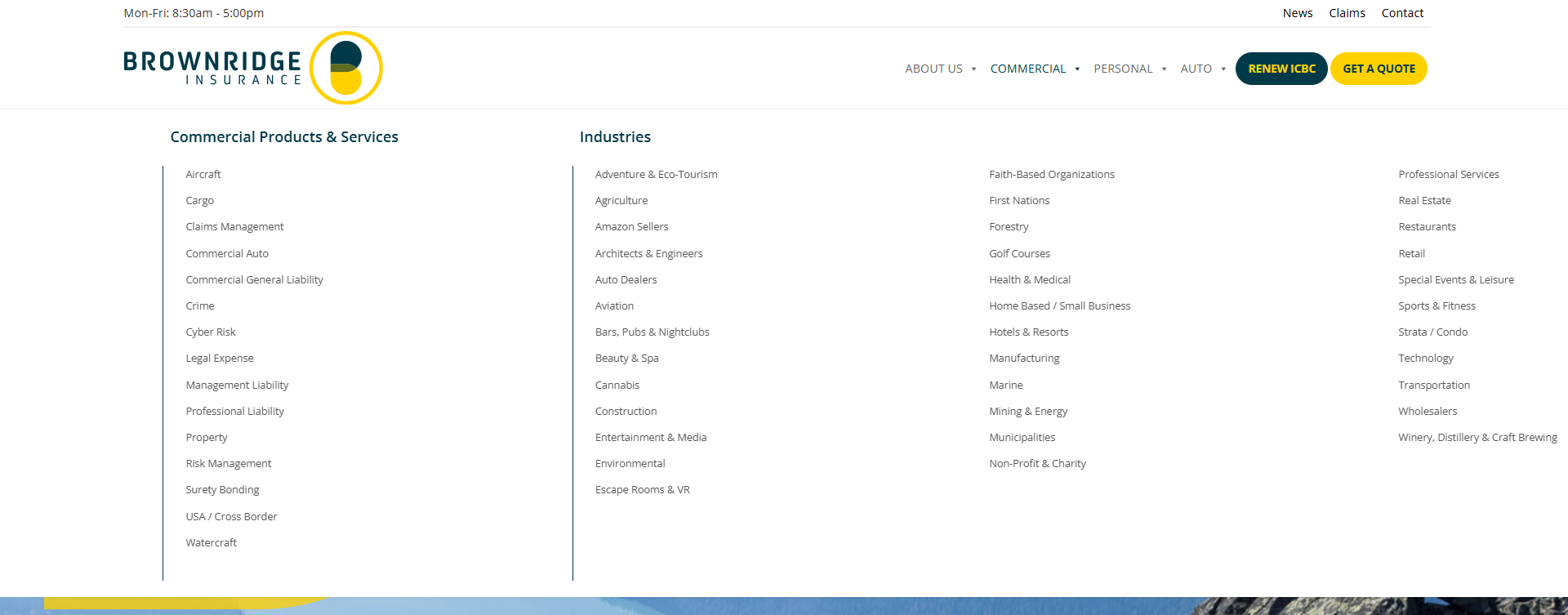
Header with MEGA Menu
This is a header variation that is combined with a plugin called Max Menu Menu.


